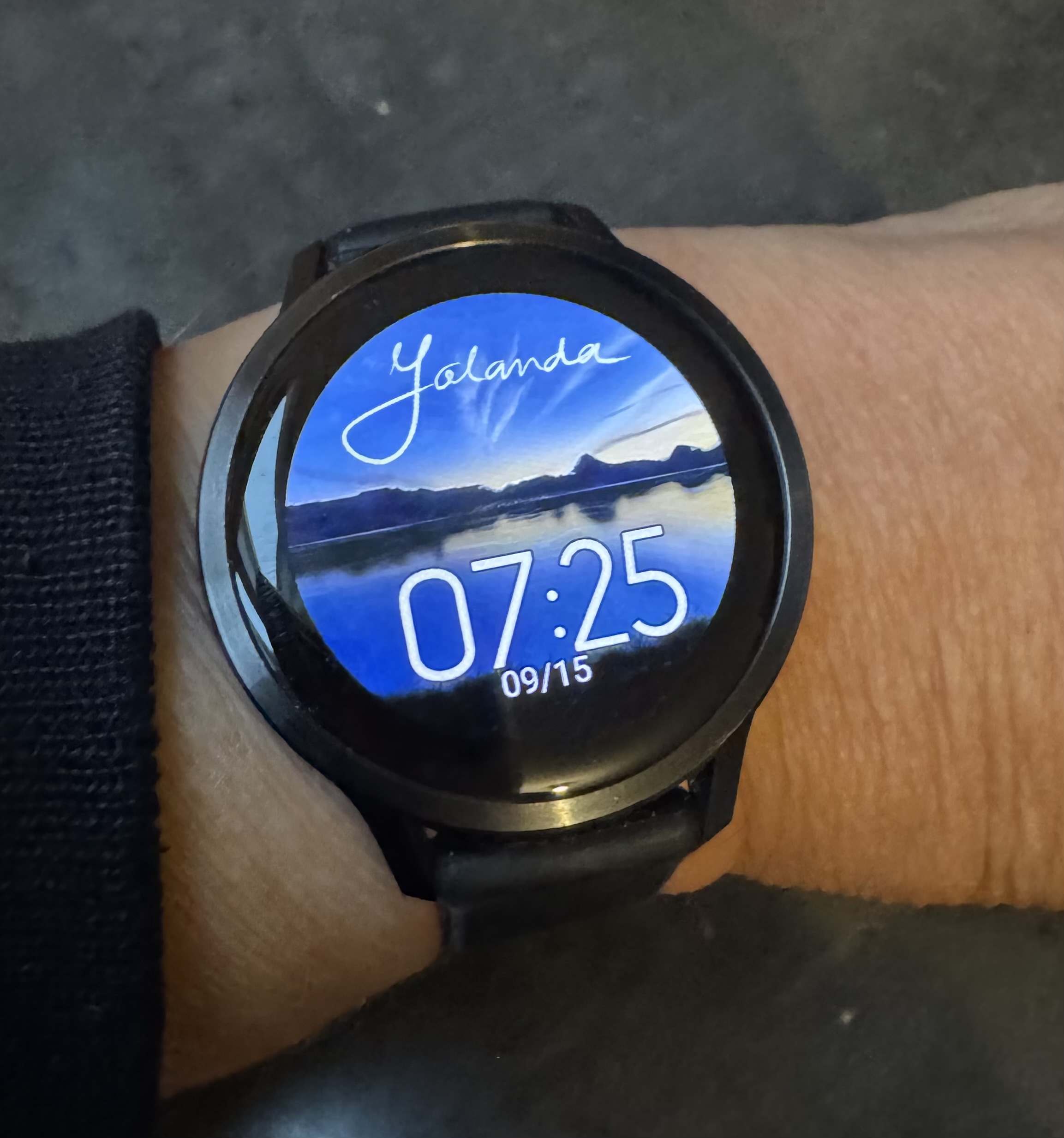
The same mountains, drawn twice. Yet they seem to have become two different landscapes.
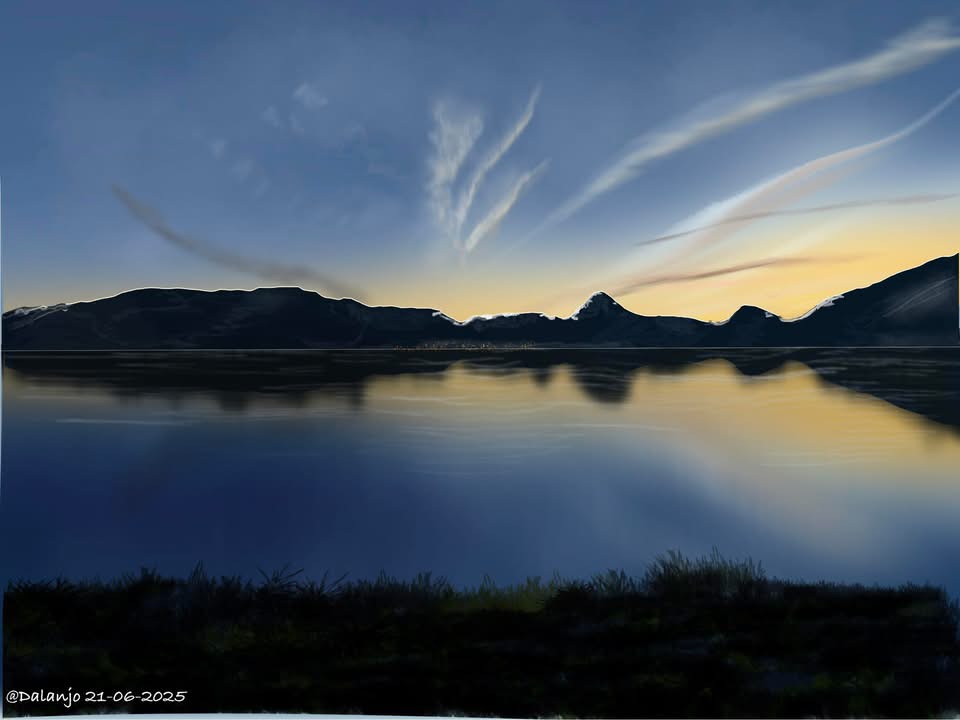
Blue dominates the first drawing. The mountains stand quietly against the sky, and the little bit of yellow above the peaks is reflected in the water. It gives the whole scene a light, calm feel.
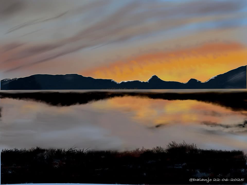
In the second drawing, orange takes over much of the sky. The blue is still there, but it is less noticeable. The warm colour makes the mountains look darker and increases the contrast. The water changes too: the reflection takes on a warmer, more orange glow.
The mountains themselves have stayed almost the same. The little peak just to the right of centre is there in both drawings, as is the dark grass in the foreground. Yet the different colours give the mountains a different feel. The cool colours make the landscape look calm, while the warm colours give it more strength and tension.
And the blue version has now found a place on my watch too. So I can carry those mountains with me.